


Since the dawn of time, the emotional heart and the logical brain have been the primary forces influencing people's behavior. And because they offer diametrically opposed approaches to solving the same problem, we’re usually forced to pick a side.
But what if the issue can be solved simultaneously by the heart and the brain? Let's do that and bring these diametrically opposed ideas together to discuss the various approaches to some of the agile metrics we use.
Table of contents:
- Brain vs. Heart: What is our relationship with the metrics?
- Which metrics should be private for the team?
- How to predict anything in Kanban?
- The good, the bad, and the ugly of metrics (Conclusion)
Brain vs. Heart: What is our relationship with the metrics?
Before explaining the various relationships with the metrics, let's define some roles.
Maria represents a heart-driven manager. She believes that every situation should be viewed through the eyes of the team. For example, if there is a mashup, some open communication can provide enough context to quickly understand the problem. The opinions are then compared to the statistically collected metrics. Nonetheless, the words of the people are usually considered superior, whereas the metrics are simply a tool to help her manage the project. The foundation is trust and the team's willingness to admit the project's current status responsibly and honestly.
Szymon is more of a data-driven person. He represents a practical approach that is more reliant on logic. As a result, each unexpected change in measurable data is properly explained. Data, he notices, do not lie, have mood swings, or forget, as people tend to do. With all of this in mind, he enjoys constantly verifying project dashboards. And when something unusual is noticed, he simply confronts the observation with his team.
As you can see, the approaches differ slightly, as the team's progress can be verified by word of mouth or on paper. But which way is better - if there’s any?
Let's put our two management approaches to the test on some specific metrics.
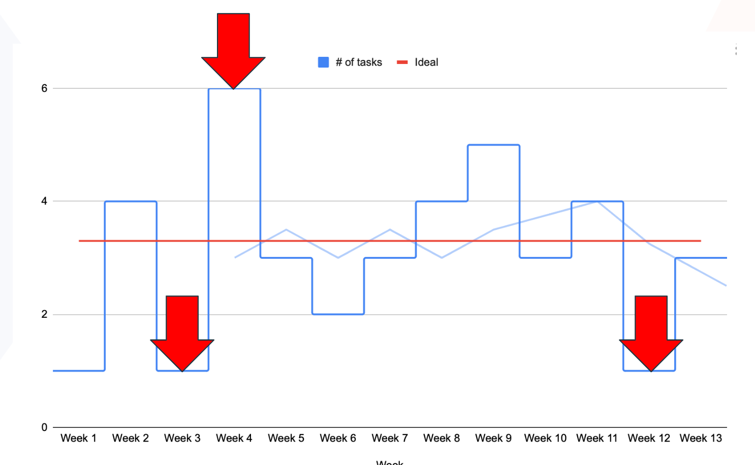
Burndown chart: the entry level of metrics
Let's begin with something simple: a burn-down chart. This is something that every manager, regardless of their level of project experience, should start with.
The vertical axis portrays the workload, so the number of things you have planned - be it tasks or story points. The horizontal axis focuses on time boxes ranging from days to months to (sometimes) years. There should be a deadline at the end. Then, we have the green line that connects the highest (initial) number of planned things with the estimated deadline, outlining an ideal scenario of burning down all tasks to zero.
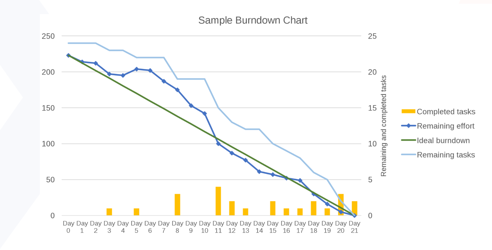
Since we're talking about real life, you should expect some fluctuations. If possible, try to predict them by adding additional metrics (like those little bars above) to mark the volume of completed tasks per time. This is an excellent source of measurable data on the project's status, essential for brain-driven managers.
Heart's perspective
As effective as the solution is, it is sometimes undervalued by heart-driven managers who may claim that the tool is too simple to use. They would rather set up a daily and collect the necessary updates. The team can discuss the current tasks - how many have been completed, what is planned for tomorrow, and so on. Overall, the day-to-day process relies heavily on communication. Once the relationships are established, management occurs more verbally than on paper.
This could work for well-formed teams with excellent communication skills. However, once the discussions are finished, and the peers have ensured that everything is under control, we sometimes may take a closer look at the graph and discover that we are now below the norm.
So, what happened here?
Brain's perspective
If we dig deeper into the data, we might discover that something occurred within the given time box; this information might or might not have been shared via status (as you became aware of the change only because you were looking at this chart). The first few days appeared flat, indicating that our peers either did nothing or were highly focused on something else—possibly even for someone else.
Then there is a wave that suggests something was altered or taken out of the sprint, but something new emerged. This took place repeatedly. In other words, our sprint plan needs to be fixed. A stakeholder might have approached our developer and said, "Hey, I know Szymon planned the sprint, but here's a little task that I want you to squeeze in," for example. It might also represent inexperience or a failure to carry out our responsibilities.
Then there is a cliff, which indicates that the person sat on a larger group of tasks and completed them all at once. Our QA begins to sweat. Because how in the world did they get 20 tickets? Then there were some upward movements, indicating that something had been added, and the flatline indicated that nobody had completed their tasks, tested them, or pushed them into production.
Nothing has been completed yet. These issues might come up daily, but when I look at this graph while drinking my coffee in the morning, I can immediately tell that something has happened. There is no conclusive explanation for each of those events. As you have just read, there could be a variety of causes. That’s when I call people to say, "Hey, we need to discuss this. Let's see what we can improve."
The Holy Trinity of sprint metrics: capacity, velocity, and predictability
Capacity, velocity, and predictability are the three favorite metrics for heart-driven managers, as they emphasize human factors more than standard graphs.
We define capacity by estimating how much the team can handle during the time box. Our estimation, which is typically supported by historical velocity and team availability (such as planned holidays, upcoming training or onboarding new teammates, and other work), is what determines the planned load.
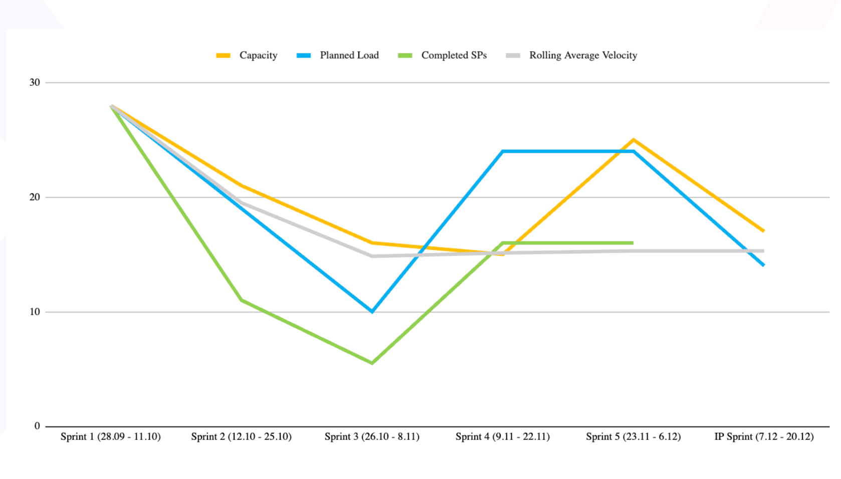
The outcome comes in numbers, which are then applied to additional metrics. And then, together, after each time box and sprint, we can discuss and see how good we were on the plan. The third element in this triangle, predictability, shows us how much of the planned work was actually completed in the past Sprint.
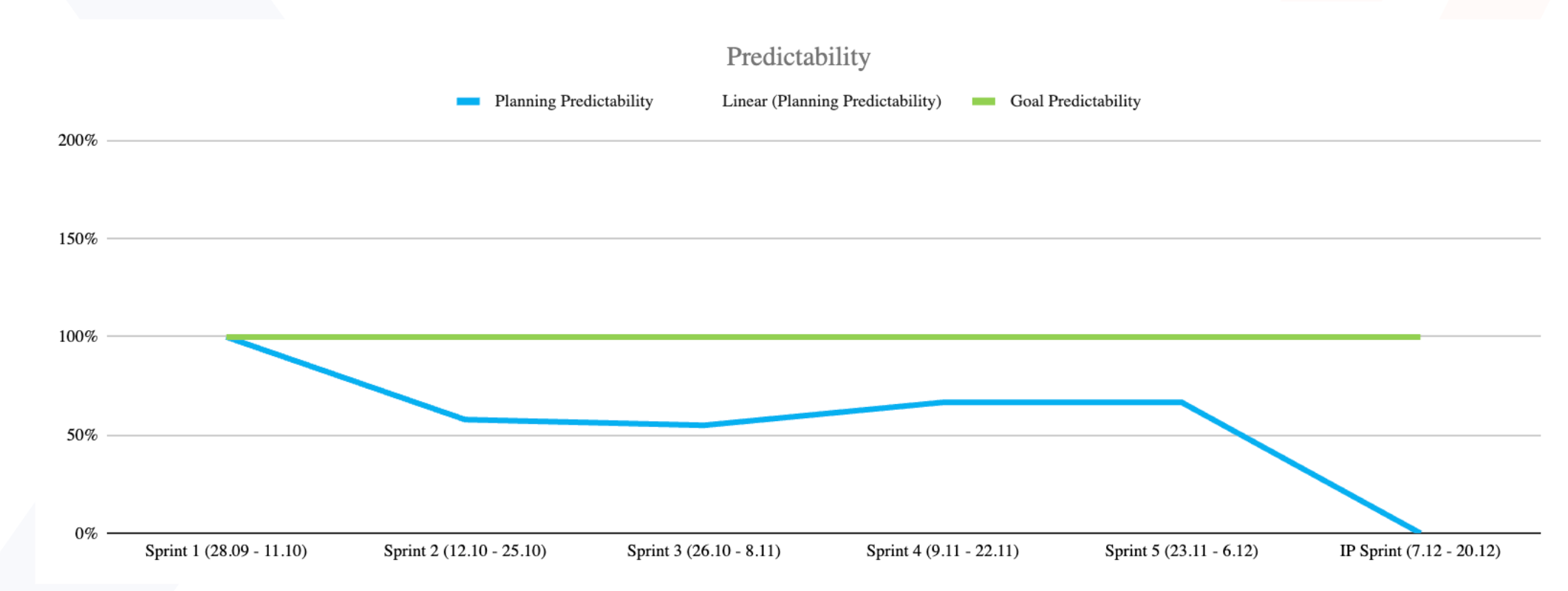
Predictions become more accurate with time and experience. As a result, the matchup for senior teams should be between 80% and 100%. They should also be able to self-alter upcoming workloads if the value is significantly lower to avoid overestimating. And if the predictability is greater than 100%, it indicates that the team is under-committing (probably to look better to the managers) and should plan a bit more ambitiously in future sprints.
This is how metrics can assist you with your inner, emotional aspect of thinking and planning. It's also an excellent tool for team learning and fine-tuning their planning sessions. You get better after each sprint as you progress.
Let's now move on to discussing which metrics should be available outside of the team. Because, once again, the narratives that our heart and brain tell us diverge slightly.
Which metrics should be private for the team?
Most metrics are only for the development team and should not be displayed outside. They are viewed as a mirror, allowing us to see ourselves realistically and verify if we are doing things correctly. As a result, that information should not be shared.
Especially if our teams' trust is jeopardized as a result of some stakeholders attempting to influence some performances based on what they saw (or thought they saw). Furthermore, when the team is aware that their metrics are being used to assess their productivity, the natural tendency is to make the grass greener and inflate the metrics. In practice, this renders the metric unusable and unreliable for its intended purpose of learning and actual process improvement.
Brain-driven managers believe in the objectivity of data. Why should they hide it from stakeholders when it has been collected, analyzed, and updated? People should use logic every day, and they should understand how metrics work. The issue is that we sometimes allow our emotions to control us. And not all of them are good.
Fear, anger, and similar emotions frequently drive our actions. So, if you're a product owner worried that your boss will scold you because your team didn't do enough this quarter, you could go to the development team and say, “Guys, I know you were busy, but maybe you have some space. Let's do some extra work, shall we?” That is motivated not by logic but by emotions and the fear of being chastised.
Or anger. If the metrics are publicly shared, we might say, “The development team could be better.” We'll try to find something that will make them look bad just because we’re terrible and use our anger to motivate our actions.
Heart & Brain Consensus:
Only high-level metrics should be made available to upper management. Process metrics should be kept private for the team. However, keep in mind that, in general, people are motivated by emotions. Do not share the metrics unless you are confident that the viewer can separate their emotions from logic. Otherwise, you may be forced to do some serious explaining to your team.
How to predict anything in Kanban?
Previous metrics were more focused on Scrum, but what about Kanban? We don't usually have sprints, so how can we make predictions?
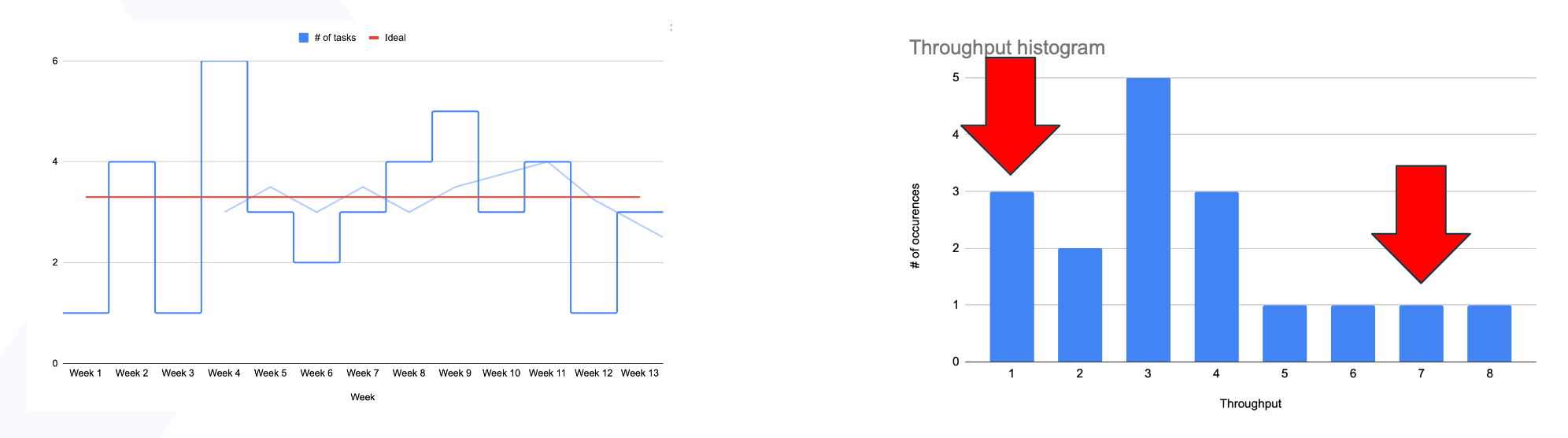
Let's begin with the throughput chart, a metric that can be used in Scrum but is irreplaceable in Kanban. It's a really quick read. The blue line indicates how many items we did complete within each time frame. The axes represent the number of weeks and items delivered. The red line depicts the overall average. And the light blue line represents the rolling average.
So this is one of the most straightforward metrics that can be used in Kanban: simply count the number of items delivered, place them on the chart or table, and that's it.
As we demonstrated with the previous metrics, heart-driven managers will - again - say, "Well, that's just the basic number of things we delivered." What's the point of doing that? We can, once again, tell each other during the standup, "Hey, I finished two tasks yesterday, and tomorrow I plan to finish one," and everything will be fine.
Work can be compared to water flowing through a pipe, where throughput represents the flow. Lower workflow is a sign that a potential block may be developing. Therefore, in an ideal scenario, throughput should gradually rise over time as the team becomes more effective and integrated.
A life-based example from Szymon:
I have two kids and drive them to kindergarten every morning. As a result, I sometimes drive two of them. When one of them is sick, I only drive one of them. When both are ill, I drive none. I've even driven three kids while picking up my daughter's classmate. That's all normal.
However, throughput only tells half of the story. If my wife asks, "OK, why have you finished with three kids today?" or my boss asks, "Why have you guys finished so many items in a week?" That will be discussed, as it usually requires some deeper context.
Throughput Histogram (the Brain)
That's why I like to combine this supporting role graph with this one to learn more about those elements. Let’s take a look at the Throughput Histogram.
A life-based example from Szymon:
The graph might as well show how often I drove zero, one, two, or three children to Kindergarten. This is the point at which my wife can take the calendar and declare, "Something is wrong. You drove zero children to kindergarten in the previous month." So, I start to explain that they were sick for two weeks, then I took them to the zoo, dropped them off at the grandpa’s, and so on.
So, my boss might ask, "Normally, you deliver three or four tasks a week - why have you delivered eight tasks one time?" That may give us more topics to discuss and analyze. Why did we deliver eight tasks so quickly? What happened?
The formula is pretty simple to use; just multiply the number of tasks by the number of times that situation appears. At this moment, the heart-driven manager asks, "OK, but what if the situation changes during that time? You will get another child, or the team will improve and deliver more items each week. As a result, that number will change."
And I'd said yes, and the histogram is the best way to control the ongoing "standard."
In an ideal situation, we should deliver more as we improve. The number of tasks completed each week should increase gradually. It will progress slowly from two to three. Three will raise the bar higher - to four. The four will mature. Then five. And it may stack at five because we are not limitless. We can deliver more tasks up to a point. That is a good thing. That means, okay, we're doing it healthily.
So, in short, simple metrics provide an opportunity to verify what is happening in the project beyond what we think we are doing.
Cycle time (the Brain)
Another method I use to verify and check things in the project is Cycle time; a metric commonly used in Kanban support teams to measure the time from the start of progress to the end.
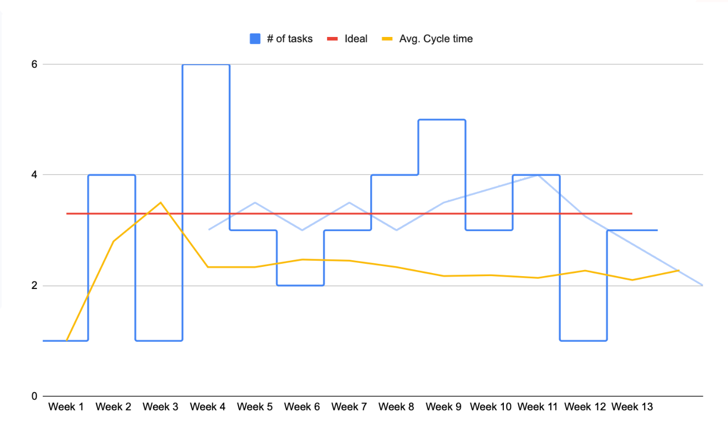
It measures how quickly we were able to deliver a solution after an incident occurred. Because when something goes wrong, everyone knows. And then they need to know how quickly we can fix it.
That is when you should look at the cycle time and say, "On average, over the last six months, we were able to finish that task in about five hours." It doesn't have to be the perfect answer, but it has to be something we can work with. We can expand on this later. And while doing that, eventually, the client should know we're delaying even more and communicating it rather than just letting him sit and wait.
Even in my ideal world of the brain, metrics, and a computer that tells us what's happening in the project (pretty soon with ChatGPT advancing around), the average, or even a simple metric like cycle time, is insufficient. And it is here that the heart provides the solution.
Cycle time scatterplot (the Heart)
The cycle time scatterplot is a metric that displays the cycle time of each task in each time box. Finding the outliers, or the specific tasks that took much longer than average, is thus made simpler. As you can see in the graph below, a couple of dots stood out compared to the 'standard' majority placed at the bottom of the chart.
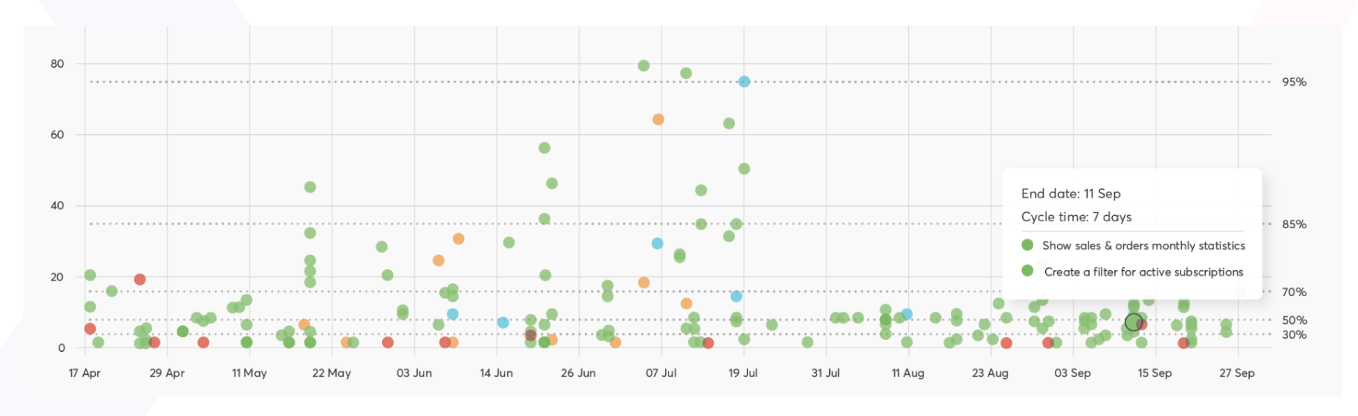
Identifying those outliers is an excellent starting point for more in-depth team discussions. Was the misalignment caused by something unexpected? Or was that just an everyday occurrence? Was the task too big and should have been split into smaller parts, or was there some unplanned work involved? Has the team's composition or morale shifted? Have we finally completed that one enormous task? So this metric assists the heart in starting a conversation about what happens, why it happens, and how we can improve.
As you can see, the scatterplot provides a solid foundation for team discussions. What's important is that it focuses on a specific event on a timeline so that it can be appropriately recognized.
Cumulative flow diagram (the Brain)
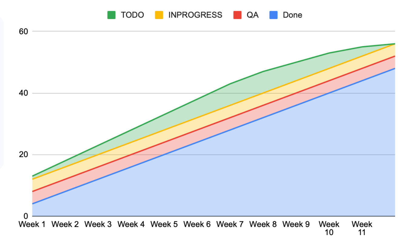
This graph depicts a perfect scenario. The green area on top represents the current backlog. The yellow is almost parallel, indicating that all tasks are added to the "in progress" status each week. The red QA area follows in perfect symmetry, and the blue "done" area grows larger each week.
Because this is a cumulative graph, the areas are stacked on top of one another and gradually merge into the bottom one. The teams can complete tasks at the same rate and without bottlenecks because the lines are nearly the same size. All tasks are completed when the green area reaches zero. The graph is also quite steep, indicating a short development and faster reaction time.
Still, this is most likely the situation we'll find ourselves in.
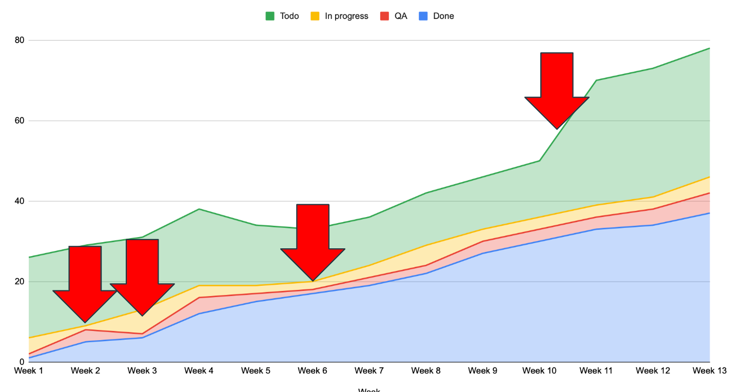
This graph has a lot of interesting things to look at. For example, around week 2., the red area expands, and the yellow area shrinks. Why? Perhaps developers switched to checking tasks, which is why there were so many in quality assurance. We notice that more tickets are being worked on concurrently in Week 3. Furthermore, only a subset of them is being tested by quality assurance personnel. Again, why? Perhaps you've been successful in promoting QAs to developer roles.
As the red area decreases, more tasks will be moved to the QA phase. We might have some problems soon. Then there's this long, hilly, green road. Someone probably woke up and said, "Hey, guys, I think this should work differently. Let's use Uber for food delivery."
If you want to get similar, quantifiable results, it’s best to start measuring your team’s activities now. Count how many tasks and tickets you complete each week in each state. You can add or remove statuses depending on what you want to measure. After the first, second, and third weeks, you will start noticing patterns or departures from that pattern.
Needless to say, this is my go-to metric while drinking my morning coffee. Due to your project's variable number of tickets in your project, this one can be updated daily, so you can almost immediately see the various changes.
The good, the bad, and the ugly of metrics: how and what to measure so you don't shoot yourself in the foot
Whether you are naturally more of a heart or logic-driven manager, you should incorporate the other side in your work. Hearts can be grounded and given a reliable jumping-off point with metrics. And Brains can really use context and specific stories behind the data that only talking to the team can provide.
So try not to use metrics without first consulting with people. And don't rely solely on talking to people without using metrics. You must strike a compromise somewhere in the middle. That's how you'll know what's happening in the project and what might happen next week. Because metrics can tell you what happened yesterday and possibly today. But they won't tell you the context and problems behind the data.
Also, try to not be too reliant on what people tell you. Sometimes people lie, forget, are angry, tired, or sad - all that will surely impact their view of reality. They may hide information from you or switch contexts for various reasons, including shyness or guilt over failing to deliver on a promise. That’s why you have your metrics as a backup: to confirm this is correct and in line with what they tell you.
So use a bit of metrics and try to talk with your people (you’ll see how cool they are!), and you'll probably be able to keep the projects running. And maybe even deliver on time.
Good luck!